In the last half of 2012 I developed our digital communications strategy for 2013. One obvious area that needed attention was our church website. One problem was looming large on the horizon in 2013.
We live in a Post-PC era
Globally PC sales are the slowest they have ever been. Tablet and smart-phone sales are rocketing. Consumer behaviour is radically shifting and the church needs to move with it.
I’ve been an advocate for the need for churches and non-profits to think ‘mobile first’ for over a year now, the long-term trends suggest that mobile usage will become the predominant way we consume web content in the future. Our own web analytics are showing that mobile web and tablet usage is increasing exponentially year on year.
Some churches were early mobile adopters and adapted a two-fold approach – a mobile site and a desktop site. That was great until tablets came along and spoilt the party. Now churches need to create a great viewing experience at multiple sizes.
Can’t we just build an app?
Many churches have started developing their own church app’s and I’m an advocate for apps. We have built one ourselves. However research shows that in the church world at least App’s are for insiders, mobile web is for outsiders. That means that if a church is on mission it should also create an experience crafted for the great commission.
Pew Research says that 60% of tablet users prefer reading news on the mobile web than via an app. While I think churches should certainly offer apps, it’s clear that having a great mobile website should be the priority.
The bottom line is that it’s not a choice between App or Web. Churches need a both/and digital communications strategy.
How do we solve this problem?
How can a church have a website that will work seamlessly on mobile/tablet and desktop in 2013? The answer is simple. Responsive designed church websites.
What is responsive design? I’m glad you asked.
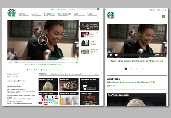
Responsive design is simply when your website detects what device you are viewing from and responds accordingly. Responsive design alters the image sizes automatically and reorders the information to a predesigned order to fit the device you are viewing from.
The benefits are quite obvious: You build a website once, and it works seamlessly across thousands of different screens. Below is Starbucks for example, same site just on different devices. (You can find out more from Ethan Marcotte who was one of the original developers of this design philosophy, it’s a bit web geeky but you’ll get the drift.)
Is responsive the only answer?
For the moment my call would be absolutely yes. But remember responsive design is just a tool. It is simply a means to help you communicate across the different devices, it isn’t an end in itself. Some day, a new thing will take over. Remember flash? Same deal.
This problem obviously isn’t just confronting churches, but all non-profits and businesses will also need to respond. Many are already responding. We are half-way through rebuilding ours.
Have you seen any decent responsive designed websites? Anything to add? Comment below