
![]()
I think I’ve seen just about every church logo there is. Good or bad design, inspirational and creative. You name it. I’ve seen it. I think the best logos are distinctive, memorable, scalable and simple enough to use in different environments.
A logo or brand-mark though is only the tip of the branding iceberg. What wraps around the logo is just as important.
Here are my top church logos so far from 2016. I’d love to know yours. Drop a comment below. I’ve also my favourites from 2014 below too. You can also see how the logo is portrayed on the church website if you click on the logo.
Cross & Anchor Church

This is a recent church plant that has created a beautiful website and I love how this logo looks and fits into the wider church branding. The name reminds me of a traditional London pub which is fun too!
Menai Anglican Church

This copy of the Menai Anglican Church logo isn’t great, but I love the simplicity of it. It feels very organic.
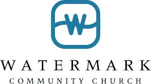
Watermark Church

While the Watermark Church logo isn’t new it has clearly been refreshed. The typography is new and the website has definately been refreshed to create a new brand positioning.
Newspring Church

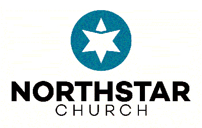
Northstar Church
Mosaic Church
![]()
Heart Church

Eagle Brook Church

2014
Here are my top ten church logos from 2014. I’d love to know yours. Drop a comment below.
1. Hillsong Church
![]()
The subtle way this logo has evolved over the years, yet maintained it’s original integrity has been fun to see. The team at Hillsong do a fantastic job of keeping the brand fresh through the years.
2. Watermark Church
I just fell in love with this logo. The way the brand is extended on the website for me takes it up a notch again.
3. Bethlehem Church

So simple, yet so powerful. An original use of white space to create the cross. I also love the green which is fresh and young.
4. MarsHill Church
![]()
If you ever wanted a church logo for blokes the Mars Hill logo is it. Love how they express it. I hasn’t really changed that much over the years.
5. Christchurch Church
![]()
This logo has a simplicity and childlikeness to it without feeling like a children’s focused ministry.
6. Jubilee Church
![]()
I’m a bit biased here as I’m originally from Derby and recently visited this church. But this is a good example that not every church has to have a brandmark. Words work too.
7. The Foundry
![]()
Understated. Classic, yet modern. Brilliant use of negative space. Top marks.
8. Lifechurch.tv
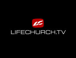
This logo has been copied many times. At first I thought it was a surf brand, but the team at Lifechurch.tv have captured the young essence of who they are so well. I chose to show it on black as I especially like it reversed out.
9. The Church Of England
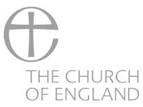
The Church of England is actually a denomination, but I do like the sense of history and timelessness of the logo, which a hint of celtic influence.
10. Lake Hills Church
![]()
The sense space and typographic excellence in the Lake Hills Church logo is what drew me to this logo. Simple yet the brandmark expresses the outdoor feeling in the name so well.
Your turn
What do you think makes a good church logo? What church logo is your favourite and why? Drop a link so we can all see it.


