I’ve worked hard to narrow down this list of the best church websites I’ve seen in 2017 to just three.
That’s right. Not a long list of the best websites. Just three.
But three church websites that I think are for very different reasons rise above the rest.
Your website or mine probably isn’t in this short-list either. Call me ruthless. That’s okay.
The websites are listed in no particular order. Just click on the picture to go to their site and check them out.
Hope City Church
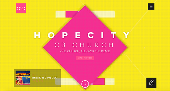
This is a video-driven, mobile responsively activated landing page. It moves quickly and with alot of vibrancy. The branding screams high energy and younger generation. It’s a large church that has been able to communicate a unique difference to what you can expect from a church very quickly.
Instead of ‘Once church, many locations.’ which has a corporate feel to it.
It says ‘One church, all over the place.’ which says relaxed, not corporate at all.
Love this!
For some, the video might be completely over-powering, but if that is the case, like me, you won’t be the target audience.
Church Of The Highlands

I’ve got to admit I fell in love with the use of typography and sense of space on this site. For such a large church they’ve made it very simple to find your way around.
They didn’t feel like they had to cram information into every area of the screen.
Based on analytics I’ve seen on church websites I’ve managed, they’ve organised the way the I would do it. Make the most visited pages, the most obvious and easy to get to. Watching sermons, new people and service times.
Cross & Anchor Church
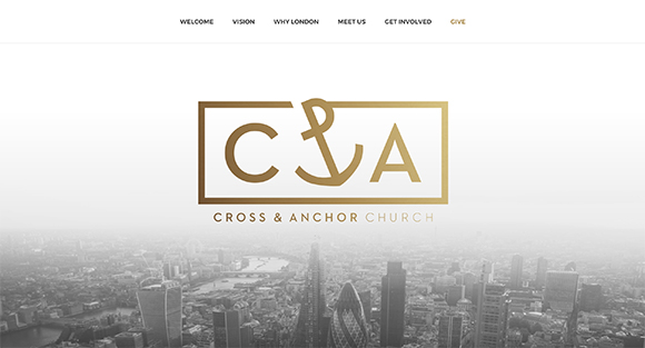
For a church in the heart of London they have owned a simple, yet stylish approach. Black and white photography and gold highlights. Not what you would expect from a church at all. By the look of the church it is early in it’s formation so extra-kudos here for even thinking about what their website means to them.
Honourable mention: Copywriting
Although the design can take much of the focus when we talk about church websites, the copywriting on this about us page is the most authentic I’ve seen.
Summary
You’ll notice that the parallax scrolling theme doesn’t get much of a mention here. I think it’s a useful visual tool but can be done badly and has been almost adopted as the default framework.
Useful Links
If you are wondering about what the word responsive means then read ‘7 Great Church Websites That Have Responsive Design.’
Read 10 Of The Best Tips That Will Improve Your Church Website.
Learn from my experience. 7 Lessons I Learnt Launching Our Church Website.
Your turn
Think you’ve found a better website? Or have a question. Leave a comment or a link below.